With the situation in the UK as it currently is, with the majority of the populace confined to our homes, it wasn’t possible that I could continue my project without addressing it one way or another. In a morbid way, it provided a sort of inspiration for the next stage of my developing project.
I’ve been inspired by so many images of people in their homes during quarantine, and there is such diversity among them. Some are happy and positive, while others address the emotional hardships we face when we’re cut off from each other. In particular, there was one photograph that I found that really resonated with me or a block of apartments at night. Photographer Karman Verdi captured a moment in the homebound lives of people, with every window having its own unique atmosphere.
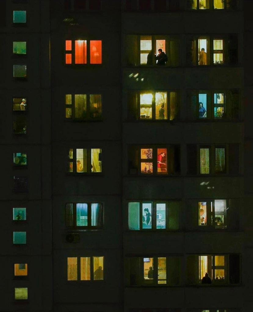
While I was thinking of what to do for the next stage of my project’s development, this photograph didn’t leave my mind and I started thinking about the story-telling possibilities of such an image and how I could utilise such a composition in my project.


I thought of a dark building covered in bright windows with all sorts of people going about their business within. To express the message that drives my project, I wanted the initial images in the windows to misrepresent the real goings-on, eluding to the ineffectiveness of image in its endeavour to capture a moment. I was also positive that AR would play a role in this piece. The act of recording the image on a phone is what represents modern active voyeurism, and without it the illustration would just be another piece of passive voyeurism to consume. Despite the newness of AR to me, I felt that this illustration wouldn’t really be worthwhile creating unless it challenged me and gave me the opportunity to to continue my learning.
The inspiration for animating this piece came from illustrator Mason London, who creates beautiful ambient animations. I’ve always wanted to do something similar, but it isn’t until now that I’ve had the time or the courage to make an attempt.
Each window would have its own unique story, characters, colour schemes, environments and animations. To do this, I needed to make sure that I had a diverse collection of characters to put in the scene.


Drawing out these characters also gave me the chance to think about the scenarios I might place them in and how I can use them to contradict an audience’s preconceptions. However, I didn’t really want to use any sort of stereotypes to construct these fictional scenarios. I wanted the scenes to speak for themselves and give my characters unique lives and personalities. I didn’t want to rely on tropes to subvert expectation, but I wanted to design my characters in such a way that their behaviour in an AR animation might contradict their appearance.
I took some inspiration from the voyeuristic artists I had looked at earlier and the sort of characters that drew their gaze. What stood out to me was the contrast between artists that are interested in real people and artists that are interested in beauty and how they framed their subjects.
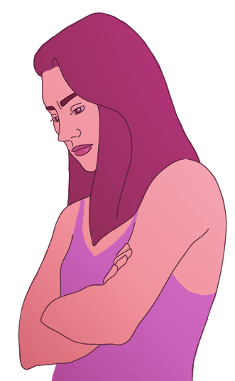
As I researched voyeuristic art there was a common figure that stood out to me in particular; the young woman.


As a lot of voyeuristic art is framed by the male gaze, it makes sense that a woman be the subject of a voyeur’s art. In my mind I had the image of a woman in a nightdress, representing something akin to a film noir damsel in distress; one who exudes sexual allure but also fragility and innocence.
The image of a woman looking sombrely into the distance is common in art, photography, and cinema. Usually this type of scene is portrayed as melancholy or pensive, but is almost always meant to be serene and beautiful. This is something I wanted to use to my advantage. I wanted to show such a scene but through AR animation bring the character to life and show that this moment of calm captured in an image is anything but. I wanted her to be angry and passionately so, discrediting any assumption that the scene is at all peaceful or that she is at all lovely or delicate. Doing so, I wanted to surprise people and make them think about how the still image is ineffective in capturing the truth of the situation.
Since I have never attempted to fully animate a character before, I decided to use the rotoscope method of animation to make things easier for myself and save time. I filmed myself carrying out the movements that I wanted for my character and reduced the frame rate of the video to around 10 fps. Using photoshop, I then traced over each frame, placing different moving items (i.e. body parts) onto different layers so I could track their movements individually through the frames, even when they weren’t visible to the camera. I did this in order to help me better understand how the body is moving so that I could draw my character freely rather than resort to simply tracing the video frames. I wanted to learn from this process and perhaps later use this technique to animate characters that have different body proportions and ways of moving.

In total, I managed to reduce the scene to 53 frames and added an additional 5 frames of my own that I used to loop the end of the animation to the beginning. These initial tracings became the basis for my final animation and helped me plot out the right frame rate to give my character realistically smooth motion. I also looked at videos of dancers and models on runways to better understand the physics of hair and fabric and help me create realistic motion for the hair and dress.
Using the initial sketches that I had made of the character in my sketchbook, I started finalising the design and experimenting with colour. I knew that I wanted to give the scene some ambient lighting, like the apartment windows of the initial photograph that had inspired me. I thought about using warm lighting in an intimate bedroom scene, or harsh blue lighting in a kitchen.
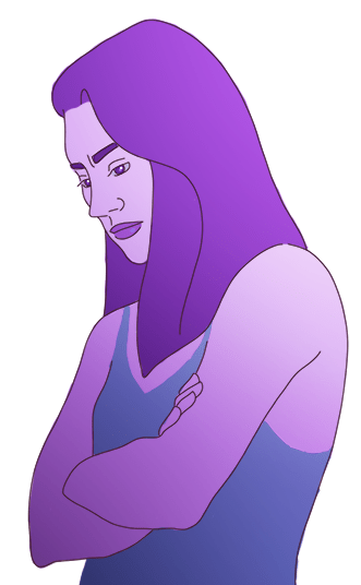
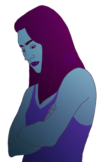
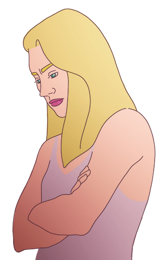
In terms of the character design, I knew that I needed to keep things as simple as possible. With this being my first real experience with animation, I knew that I would be pushing my limits a bit too far if I tried to apply too much tone or detail to the character because I would need to think carefully about the lighting, and since I hadn’t even designed the setting yet I didn’t want to lock in my options until I was certain. Making any changes to the character in later stages would also be difficult because it would mean applying changes to 58 frames, so I tried to be decisive in my initial design, which is a concept I’m still practicing.
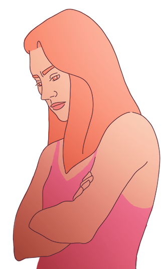
It wasn’t until I had finished drawing out the frames and applying the base colours to the character that I made the decision to light the scene with pink/ purple. I thought that a pink lighting would make the scene more intimate and maybe help in deceiving viewers into giving the initial image a more romantic context.
I also decided on a modern kitchen setting because I thought that it might provide good visual interest without detracting from the main object of the scene, which is the character.
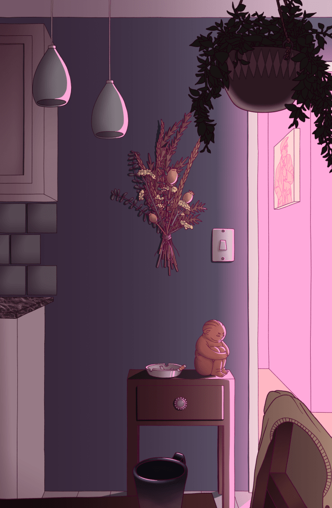
Later on while I was working on finishing the animation, I wanted to add some ambient animation to integrate the animated character with the background. Initially I had wanted to animate the entire scene, including having precarious items jostle as the character stamps their feet or maybe add an effect of rain hitting the window. However, time was not on my side, and I could only afford to create some small ambient animation, which would be the smoke from the cigarette in the ashtray.

The final animation (reduced quality).

The last step was to frame the scene with a window. This would be the image that is printed and used as a trigger for the AR effect. The idea is for the animation to show specifically over the window.

I wanted to create some contrast between the interior of the home and the exterior, so I used more green tones on the bricks to contrast with the pink light. With that, the trigger image and animation was complete, and all that was left was to create the AR interaction.
After experimenting with Unite AR initially and seeing how glitchy it could be, I knew that I needed to find an AR program that gave me greater control. I referred back to the artists that use AR; Susi Vetter and Nadine Kolodziey.
It’s by looking at these artists that I discovered Spark AR studios, which turned out to be a much better choice than Unite AR. It allowed me much greater control over the positioning of the effect, it gives greater options for different types of triggers and effects, and can be integrated with both Facebook and Instagram so that videos can be quickly shared on social media. I thought that in the long term, using this software for my AR work would allow for greater reach of my AR illustrations and people may be more willing to download the viewer to see my work if it gives them access to other AR experiences on social media.

I also found Spark AR to be far more responsive than the other AR programs I had experimented with. It was really good at keeping track of the trigger image and making sure the animation stayed in the right position, unlike others that tended to glitch out if the trigger image wasn’t centred in the viewer.

Overall, I’m very happy with the results of this piece. If I could do it again I don’t think there is much that I would change about it. In terms of the composition, I would probably try to add more interesting detail to the interior, and of course I would have liked to add more ambient animation to the scene to really bring it to life. If I could go back, I would also probably add one or two more frames to the end of the animation to smooth out the transition between the last frame and the first.
Making this piece taught me just how time consuming animation can be. I had hopes at the beginning to create a series of AR illustrations just like this and have a large poster of apartment windows that can be scanned to show similar animations. However, considering how little time I have to put something like this together, it probably won’t be possible unless I invest in a project like this as a final piece. While making this animation was a fast learning process, I still think that it would take at least a couple of weeks to make another one of these, especially if I was to try and use characters with more complicated physiology that would require more references.
In terms of using a concept like this in my final project, the main issue I face is a lack of a final show. In person, an illustration like this could be really fun and interesting to interact with, especially if I printed it on a large scale. Imagine a wall-sized poster covered in windows with hidden AR interactions. People could go around the different windows zooming in on the details and finding hidden animations. However, pretty much all impact of AR is lost if it’s just displayed on a screen. There is also the disheartening possibility that no one would even realise that the AR element exists depending on how my work is displayed in an online gallery, or if they would go to the effort when it’s easier to just scroll ahead to the next piece of art.
For the next step of my project, I have to overcome this problem. Working in 2D may no longer be an option if there is no chance for people to interact with my work in person. I might need to consider working in 3D somehow, or maybe I just need to rethink the concepts behind my AR experiences. Either way, I can only hope that even if my work is only presented on a digital scale, people will still be motivated to interact with it rather than mindlessly scroll past it.

One reply to “AR Project”
Comments are closed.