I finally decided what direction to take my final project. It happened quite accidentally when I was browsing artist for inspiration and came across the illustrations of Andre Wee.

Wee made a 360 panoramic illustration that really inspired me to explore the idea further. It felt like a really natural decision to me; moving from augmented reality to virtual reality. It also made a lot of sense the more I tried to apply it to my ideas.
I continued researching to find out how it’s done and in the process discovered a couple of other artists:
Jama Jurabaev
Yog Joshi

and Sergey Orekhov.
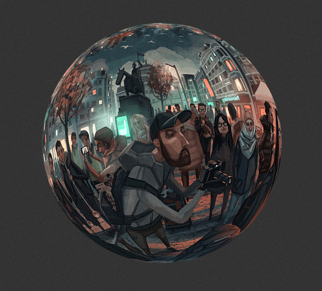
The interaction required to mover around their illustrations online felt like the perfect kind of interaction I needed for my project. I could use the same principals a my AR illustrations but with greater focus on the content rather than letting the effects take centre stage.
In terms of my concept, I thought that the best way to visually interpret my ideas was to have a digital audience literally hidden within the illustration. So, when you initially interact with the illustration the first thing you would see is the subject/subjects as they see themselves or as they see themselves in reality. Then, through interaction, one is able to find the digital audience that has always been present but maintains distance from the subject. So, it’s like Suler said; perceived privacy is caused by a lack of interaction. When an audience interacts with the illustration, that illusion of perceived privacy is dispelled.
Now, I just had to make the illustrations.

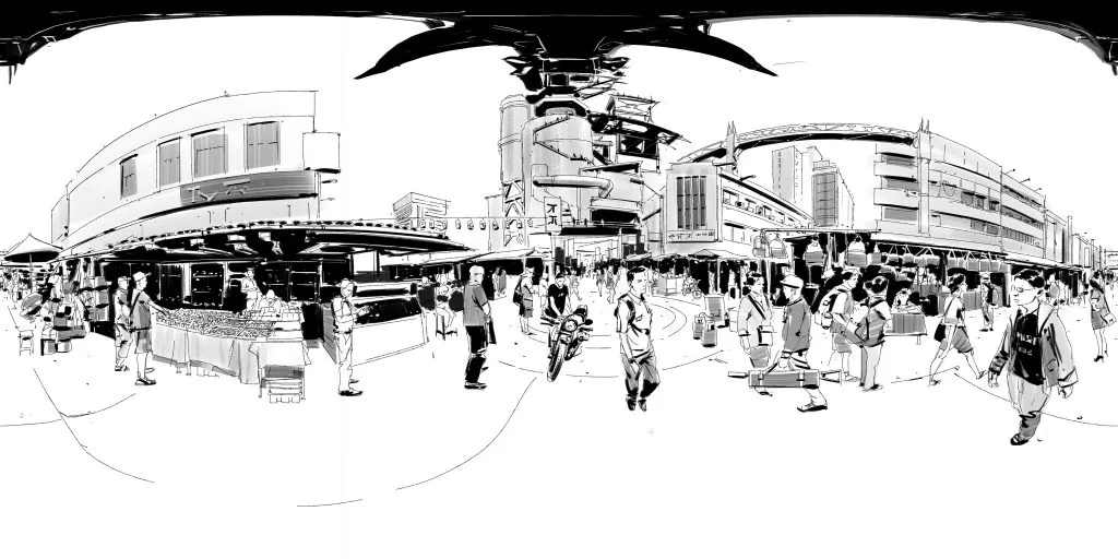
I sketched out a couple of rough compositions on a panoramic grid.


I as inspired by the colours of some of my earlier compositions and wanted my panoramas to focus on contrasting colours to create a tonal shift as people move about the illustration.
It took a while for me to decide what sort of colouring style I would use for these panoramas. While I liked the more subtle, painterly style of working, it tended to be quite time consuming and required me to be more cautious when applying tone. On the other hand, the vector style of colouring was too simple and looked too flat to keep me interested. In the end, I decided on cross-hatched colouring. I really liked the sketchy quality and when I zoomed in on the panoramas as I was working on them it was really fascinating to be able to see all of my little line marks of different colours overlapping. To me, it added an extra level of interest to my illustrations.

These are images to add to the environment of my panorama, i.e. photos and posters that tell a bit more about the character. I also started sketching up character designs since I knew that the characters I used would have a serious impact on the environments I placed them in as well as the overall composition.


